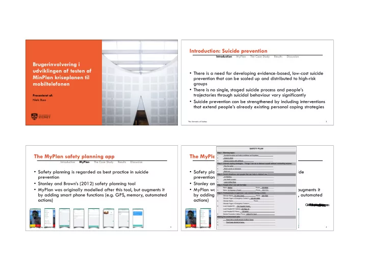

Introduction: Suicide prevention Introduction MyPlan The Case Study Results Discussion Brugerinvolvering i udviklingen af testen af • There is a need for developing evidence-based, low-cost suicide MinPlan kriseplanen til prevention that can be scaled up and distributed to high-risk mobiltelefonen groups • There is no single, staged suicide process and people’s trajectories through suicidal behaviour vary significantly Presenteret af: Niels Buus • Suicide prevention can be strengthened by including interventions that extend people’s already existing personal coping strategies The University of Sydney The University of Sydney � 2 The MyPlan safety planning app The MyPlan safety planning app Introduction MyPlan The Case Study Results Discussion Introduction MyPlan The Case Study Results Discussion • Safety planning is regarded as best practice in suicide • Safety planning is regarded as best practice in suicide prevention prevention • Stanley and Brown’s (2012) safety planning tool • Stanley and Brown’s (2012) safety planning tool • MyPlan was originally modelled after this tool, but augments it • MyPlan was originally modelled after this tool, but augments it by adding smart phone functions (e.g. GPS, memory, automated by adding smart phone functions (e.g. GPS, memory, automated actions) actions) Quick Messages Warning signs Front page Hope Box Strategies Be safe Menu The University of Sydney � 3 The University of Sydney � 4
The Case Study Findings 1: Benefits and limitations of the app Introduction MyPlan The Case Study Results Discussion Introduction MyPlan The Case Study Results Discussion • The aims of the study was: 1) to explore different stakeholder • The participants embraced the MYPLAN app as a tool that, to perspectives on the MYPLAN safety planning app and 2) to some extent, could interrupt the suicidal process and give them a examine significant developments of the app during the sense of increased personal control participatory research and development strategy • However, they also identified limitations, in particular that it was • Design: Qualitative case study not regarded as useful for persons who were very distressed • Participants: Australian and Danish MyPlan stakeholders • Learning how to effectively use the safety plan was not • Data collection: Four focus groups in Denmark and five perceived as an intuitive process and face-to-face psychosocial workshops (three workshops in Australia and two in Denmark) support and additional online support should be considered • Data were subjected to thematic and discourse analyses The University of Sydney � 5 The University of Sydney � 6 Findings 1: Benefits and limitations of the app Findings 1: Benefits and limitations of the app Introduction MyPlan The Case Study Results Discussion Introduction MyPlan The Case Study Results Discussion Josie: I think it is hard to stick to it [the safety plan] when you are so Josie: I think it is hard to stick to it [the safety plan] when you are so • The participants embraced the MYPLAN app as a tool that, to • The participants embraced the MYPLAN app as a tool that, to far out that it almost gives you peace of mind to feel bad. Then it’ s far out that it almost gives you peace of mind to feel bad. Then it’ s some extent, could interrupt the suicidal process and give them a some extent, could interrupt the suicidal process and give them a hard to turn round and start using a tool to get better. You have to hard to turn round and start using a tool to get better. You have to sense of increased personal control sense of increased personal control put effort into it. put effort into it. • However, they also identified limitations, in particular that it was • However, they also identified limitations, in particular that it was Sigourney: Yes, when you are so far into the red zone. It’ s hard to Sigourney: Yes, when you are so far into the red zone. It’ s hard to not regarded as useful for persons who were very distressed not regarded as useful for persons who were very distressed use any tool in that space because your thoughts [about self-harm/ use any tool in that space because your thoughts [about self-harm/ • Learning how to effectively use the safety plan was not • Learning how to effectively use the safety plan was not suicide] are fixed. There is one thing you want and that is how it is suicide] are fixed. There is one thing you want and that is how it is perceived as an intuitive process and face-to-face psychosocial perceived as an intuitive process and face-to-face psychosocial and you forget everything else. and you forget everything else. support and additional online support should be considered support and additional online support should be considered The University of Sydney � 7 The University of Sydney � 8
Findings 2: Phased user-involving Findings 2: Phased user-involving Introduction MyPlan The Case Study Results Discussion Introduction MyPlan The Case Study Results Discussion • The analyses identified three consecutive phases in the • The analyses identified three consecutive phases in the development of the app: development of the app: Sarah: “It says the word suicide a lot and it says a lot of words that • Phase one: ‘Suggesting core functions’ • Phase one: ‘Suggesting core functions’ probably when you are in distress you don’t need to be confronted with. And more importantly, it is talking about and not to you again, • Phase two: ‘Refining functions’ • Phase two: ‘Refining functions’ which is really kind of demoralising. I feel like it could be a lot • Phase three: ‘Negotiating the finish’. • Phase three: ‘Negotiating the finish’. shorter and more pleasant very easily.” • The user involving processes continued to prevent ‘closure’ and • The user involving processes continued to prevent ‘closure’ and challenged researchers and app developers challenged researchers and app developers The University of Sydney � 9 The University of Sydney � 10 Findings 2: Phased user-involving Findings 2: Phased user-involving Introduction MyPlan The Case Study Results Discussion Introduction MyPlan The Case Study Results Discussion Phase 1: Suggesting Between Phase 2: Refining functions. Between Phase 2 and Phase 3: Negotiating After Phase 3 core functions. DK Phase 1 and DK Workshop #1 and #2 and Phase 3 the finish. AUS Focus group #1-4 Phase 2 AUS Workshop #3 Workshop #4 and #5 • The analyses identified three consecutive phases in the • The analyses identified three consecutive phases in the Users suggested Development The location of the two Implementation of The need for better On-boarding speed-dialling of wireframes buttons was discussed and two buttons on front on-boarding information about how development of the app: development of the app: Sarah: “It says the word suicide a lot and it says a lot of words that Sarah: “It says the word suicide a lot and it says a lot of words that buttons. The colours with different they were placed at the page. A yellow ‘Help’ information, to assign contacts to of the buttons should • Phase one: ‘Suggesting core functions’ types of bottom of the front page. The button with a explaining the way to the two buttons was • Phase one: ‘Suggesting core functions’ probably when you are in distress you don’t need to be confronted probably when you are in distress you don’t need to be confronted reflect ‘the degree of menus and yellow button should be telephone icon and a add contacts to discussed. emergency’ (yellow/ with. And more importantly, it is talking about and not to you again, different named ‘Help’ and was red ‘Emergency’ buttons, was noted. Implementation of two with. And more importantly, it is talking about and not to you again, • Phase two: ‘Refining functions’ • Phase two: ‘Refining functions’ red). They should be opportunities assigned a telephone icon. button with a white The icon on the buttons on front page. which is really kind of demoralising. I feel like it could be a lot which is really kind of demoralising. I feel like it could be a lot simple to use: an • Phase three: ‘Negotiating the finish’. for placing an The red button should be exclamation mark. yellow button should A yellow ‘Help’ • Phase three: ‘Negotiating the finish’. emergency call alarm button named ‘Alarm’ and was Alarm call in two be a telephone and a button with a shorter and more pleasant very easily.” shorter and more pleasant very easily.” should be made with assigned an exclamation mark clicks from front page head in a circle. The telephone icon and a • The user involving processes continued to prevent ‘closure’ and • The user involving processes continued to prevent ‘closure’ and no more than two icon. The way to assign (but a four-digit icon on the red button red ‘Emergency’ challenged researchers and app developers challenged researchers and app developers clicks contacts to buttons was access code was also should be a white button with a discussed and the number of added). Maximum of cross in a red circle telephone icon possible contacts to assign to 10 ‘yellow’ contacts the yellow button should be ten The University of Sydney � 11 The University of Sydney � 12
Recommend
More recommend