Figure 1. Superposition of duplex melting curves After amplification - PDF document
Figure 1. Superposition of duplex melting curves After amplification of heterozygous DNA (or a mixture of any two genotypes of a biallelic SNP) two types of forward strands reassociate independently with two types of reverse strand, forming two
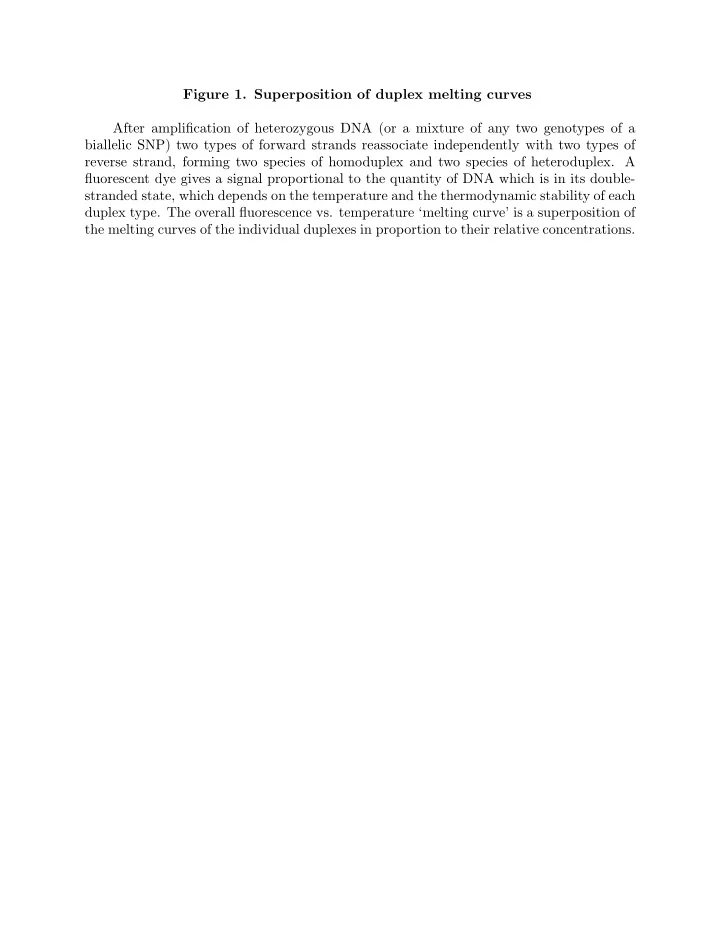
Figure 1. Superposition of duplex melting curves After amplification of heterozygous DNA (or a mixture of any two genotypes of a biallelic SNP) two types of forward strands reassociate independently with two types of reverse strand, forming two species of homoduplex and two species of heteroduplex. A fluorescent dye gives a signal proportional to the quantity of DNA which is in its double- stranded state, which depends on the temperature and the thermodynamic stability of each duplex type. The overall fluorescence vs. temperature ‘melting curve’ is a superposition of the melting curves of the individual duplexes in proportion to their relative concentrations.
Figure 2. Distinguishable and Indistinguishable Genotypes When the wild-type and mutant homozygous genotypes are symmetric with respect to nearest-neighbor thermodynamics, their normalized melting curves are indistinguishable. This figure shows three replicate normalized melting curves of each of the three genotypes of the H63D (Hemochromatosis) mutation, which obeys this symmetry. Six curves repre- senting the wild-type and mutant homozygous genotypes appear as one curve, while the normalized melting curves of the heterozygote appear as another easily distinguishable curve.
Figure 3a. Theoretical Dependence Of Heteroduplex Content On Mixture Fraction This figure shows the magnitude of the heteroduplex content differences amomg mix- tures obtained by adding wild-type DNA to DNA of each of the three genotypes of a bi-allelic SNP (W=wild-type, M=mutant homozygous, H=heterozygous) in the relative proportions x of added wild-type (the ‘mixture fraction’) to 1 − x of the varied genotype. We assume that strands of different types associate independently after either PCR ampli- fication is completed or a subsequent dissociation by heating and reassociation by cooling have been performed. We seek the mixture fraction providing the greatest separation of heteroduplex content between the resulting mixtures, represented by the highest point on the lowest among the three graphs. This point which is marked at x = 1 7 , gives the optimal mixture fraction.
Figure 3b. Theoretical Duplex Melting Curves and Difference Curve This figure gives the melting curves for the four duplex species of heterozygous or mixed genotype H63D amplicons as predicted by nearest-neighbor theory model with pa- rameters described in (SL match and CC,GG). The wild-type and mutant homozygous curves are identical. It also shows the theoretical heterozygote melting curve obtained as the equally weighted average of the four duplex curves, and the standard difference curve, the difference between the average homoduplex curve and the average heteroduplex curve. As shown in the text, the difference between curves corresponding to any two genotype mixtures is given by their absolute heteroduplex content difference times this standard difference curve. Thus, the difference between the heterozygote melting curve and the overlapping homoduplex curves, which is also shown, is equal to the standard difference curve scaled by 1 2 , the heteroduplex fraction of an amplified heterozygote.
Figure 4. Experimental Melting Curve Separation Dependence On Mixture Fraction This figure shows the mean and standard deviation (error bars) of the experimentally measured maximum melting curve separation between replicates of mixtures of wild-type DNA with either mutant heterozygous or heterozygous samples, and the mean of the wild- type replicates, as a function of the mixture fraction. The values are normalized by a factor which makes the difference for an unmixed heterozygous sample equal to 1 2 to agree with the theoretical prediction in terms of heteroduplex content (superimposed).
Figure 5a. Genotype Separation At Optimal Mixture Fraction 4/28 This figure shows the normalized melting curves for three replicates of optimal mix- tures of wild-type DNA and each genotype of sample. As predicted, the mutant homozy- gous curves lie equidistant from the wild-type curves and the barely altered heterozygous curves.
Figure 5b. Genotype Separation At Non-Optimal Mixture Fraction 9/28 Figure 5c. Genotype Separation At Non-Optimal Mixture Fraction 14/28 Figure 5d. Genotype Separation At Non-Optimal Mixture Fraction 19/28 These figures show the normalized melting curves for three replicates of other-than- optimal mixtures of wild-type DNA and each genotype of sample. In Figure 5b, with 28 near x = 1 9 mixture fraction is 3 , the mutant homozygous curves and the heterozygous curves have become indistinguishable, as predicted. In Figure 5c, with mixture fraction is 14 28 , i.e., wild-type and sample DNA mixed in equal proportions), the mutant homozygous curves and the heterozygous curves are also difficult to distinguish. In Figure 5d, with 19 2 mixture fraction is 28 near the upper local maximum x = 3 , the mutant homozygous curves and the heterozygous curves have reversed position and are distinguishable, but not nearly as well as at the optimal mixture fraction.
Figure 6a. Experimental Difference Curves Of Pure Genotypes Figure 6b. Experimental Difference Curve Of Optimally Mixed Genotypes These figures show the difference of normalized melting curves of unmixed and op- timally mixed samples of the three genotypes and the mean of the wild-type normalized melting curve replicates. The shape of the curves reflects the predicted standard difference curve shape, and the amplitude agrees with the predicted dependence on heteroduplex content difference.
Figure 7a. Raw TGCE Duplex Arrival Frequency Data Figure 7b. Normalized TGCE Duplex Arrival Frequency Data These figures show the raw and normalized measurements of duplex arrival frequency (counts per frame) for three replicates of each genotype and wild-type DNA with mixture 9 fraction x = 28 . After normalization by shifting and scaling the largest peaks to a common location and height, the common heteroduplex content of the mutant homozygous and heterozygous sample mixtures for this mixture fraction are visible from the common first and second heteroduplex peak heights.
Figure 8. Heteroduplex Content Dependence On Mixture Fraction From TGCE This figure shows the mean and standard deviation (error bars) of the experimentally derived heteroduplex content of replicates of mixtures of wild-type DNA with either mutant heterozygous or heterozygous samples, as a function of the mixture fraction. The values are adjusted by a factor which makes the value for control heterozygous samples equal to 1 2 to agree with the theoretical prediction of heteroduplex content (superimposed).
Recommend
More recommend
Explore More Topics
Stay informed with curated content and fresh updates.










![Figure 1: Team Logo 2 Figure 2: AISC SSBC Event Logo [1] Figure 3: Vertical Load locations [1]](https://c.sambuz.com/492196/figure-1-team-logo-s.webp)
