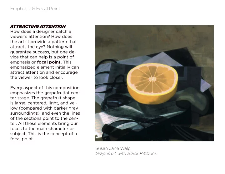

Emphasis & Focal Point ATTRACTING ATTENTION How does a designer catch a viewer’s attention? How does the artist provide a pattern that attracts the eye? Nothing will guarantee success, but one de- vice that can help is a point of emphasis or focal point. This emphasized element initially can attract attention and encourage the viewer to look closer. Every aspect of this composition emphasizes the grapefruitat cen- ter stage. The grapefruit shape is large, centered, light, and yel- low (compared with darker gray surroundings), and even the lines of the sections point to the cen- ter. All these elements bring our focus to the main character or subject. This is the concept of a focal point. Susan Jane Walp Grapefruit with Black Ribbons
Emphasis & Focal Point This painting by Henri Matisse does not have the central, obvious target that is evident in Grapefruit , but the focal point is unambiguous and even humorous. The small red turtle is emphasized by contrast of size , unique color , and isolation . The figures direct our attention as well as we follow their gaze to the focal point. In this case even a very small area of emphasis is powerful enough to need balanc- ing counterpoints such as the bright hair of the left-hand fi gure and the abstracted blue stripe of water at the top of the painting. Henri Matisse Bathers with a Turtle
Emphasis & Focal Point This photograph is a view of an ordinary street scene. The large pine tree might go unnoticed in a stroll through the neighborhood. Several things contribute to the emphasis on this tree in the pho- tograph: placement near the cen- ter, large size , irregular shape , and dark value against the light sky. Jeff Wall The Pine on the Corner
Emphasis & Focal Point More than one focal point Sometimes an artwork contains secondary points of emphasis that have less attention value than the focal point. These serve as accents or counterpoints as in the Matisse picture. However, the designer must be careful. Several focal points of equal emphasis can turn the design into a three-ring circus in which the viewer does not know where to look first. Interest is replaced by confusion: When everything is empha- sized, nothing is emphasized. When everything is emphasized, nothing is emphasized
Emphasis & Focal Point EMPHASIS BY CONTRAST As a rule, a focal point results when one element differs from the others . Whatever interrupts an overall feeling or pattern automatically attracts the eye by this dif- ference. When most of the elements are dark, a light form breaks the pattern and becomes a focal point. When most of the elements are muted or soft-edged, a bold contrast- ing pattern will become a focal point. George Stubbs Zebra
Emphasis & Focal Point EMPHASIS BY CONTRAST In an overall design of distorted expressionistic forms, the sudden introduction of a naturalistic im- age will draw the eye for its very different style. James Ensor Self-Portrait Surrounded by Masks
Emphasis & Focal Point Karl Kuntz EMPHASIS BY CONTRAST Text or graphic symbols will be a focal point (in this case, the eye is drawn to the num- ber 16. (top) When the majority of ele- ments are black and white, color will stand out as in Thomas Nozkowski’s work (bottom). Thomas Nozkowski Untitled
Emphasis & Focal Point EMPHASIS BY ISOLATION A variation on the device of emphasis by contrast is the useful technique of emphasis by isolation. There is no way we can look at this design and not focus our attention on that ele- ment at the bottom. It is identi- cal to all the elements above. But simply by being set off by itself, it grabs our attention. This is contrast, of course, but it is contrast of placement, not form . In such a case, the element need not be any different from the other elements in the work. Call for entries for AIGA/New York show. “Take Your Best Shot.” Design- er: Michael Beirut, Vignelli Associ- ates, New York.
Emphasis & Focal Point EMPHASIS BY ISOLATION In the painting by Eakins the doctor at left repeats the light value of the other figures in the operating are- na. All the figures in this oval stand out in contrast to the darker figures in the back- ground. Isolation gives extra emphasis to this doctor at the left. Thomas Eakins The Agnew Clinic
Emphasis & Focal Point EMPHASIS BY ISOLATION Gérôme’s painting uses isolation to create a hierarchy of emphasis. The cluster of figures around the dying Pierrot is isolated to the left, the departing Harlequin to the right, and the awaiting car- riage in the center background. Gérôme The Duel after the Masquerade
Emphasis & Focal Point In neither of these examples is the focal point directly in the center of the composition. This placement could appear too obvious and contrived. However, it is wise to remember Eakins that a focal point placed too close to an edge will tend to pull the viewer’s eye right out of the picture. Notice in Eakins’s painting how the curve of the oval on the left side and the doctor looking to- ward the action at right keep the isolated figure from directing our gaze out of the picture. Gérôme In Gérôme’s painting the dra- matic cluster of figures on the left is balanced by the departing characters on the right. Even the sword is isolated on the ground for emphasis.
Emphasis & Focal Point EMPHASIS BY PLACEMENT It does not require much in the way of proof to say that putting something at the center of a composition creates emphasis. In fact, it is often a criticism of naïve or boring compositions to notice that the subject is plopped down smack in the center. So then it becomes interesting to see how the center can be used in a subtle way to achieve em- phasis. Gérôme The Duel after the Masquerade
Emphasis & Focal Point EMPHASIS BY PLACEMENT Susan Moore’s portrait of her daughter offers a threequar- ter view and avoids a frontal “mug shot” composition. The center of the painting is not the center of her face. The central vertical axis of the painting does intersect her right eye and acts to draw attention to her gaze at us. We make eye contact through this placement. It succeeds because the focal point does not have to com- pete with other elements for prominence. Susan Moore Vanity (Portrait 1).
Emphasis & Focal Point EMPHASIS BY PLACEMENT The position of the most famous apple of all time is also near the center of B. The painting is busy and crowded, and the passing of the apple takes place at the inter- section of the tree trunk and the lines formed by the arms of Adam and Eve. The composition has an equal balance to the left and right of this focal point, and the key element is emphasized It succeeds because the focal point does not have to compete with other elements for promi- nence. Lucas Cranach the Elder Adam and Eve
Emphasis & Focal Point EMPHASIS BY PLACEMENT The bull’s-eye of a dartboard would be the simplest illus- tration of an absolute focal point. This is the essence of a radial design: the center of a circle from which all ele- ments radiate. Radial designs are more common in archi- tecture (temples) or the craft areas (quilts and ceramics) than in two-dimensional art. In pictures, perspective lines can lead to a point of em- phasis, and the result can be a radial design.
Emphasis & Focal Point EMPHASIS BY PLACEMENT In Vermeer’s painting the girl is the focal point, and the perspective lines of the interior all direct our eyes back to the figure. It is a mark of the subtlety and complexity of Vermeer’s work that the painting is not simply constructed to point to the main figure but also unfolds other areas of interest and keeps our attention and involvement . Notice how the one line on the floor that would lead straight from the viewer’s position to the girl is ob- scured by the tapestry and the cel- lo. Vermeer employs the power of a radial design without overstating it. Vermeer A Lady at the Virginals with a Gentleman (The Music Lesson)
Emphasis & Focal Point DEGREE of EMPHASIS ONE ELEMENT A specific theme may at times call for a dominant, even visually overwhelming focal point. The use of a strong visual emphasis on one element is not unusual. In the graphic design of newspaper advertisements, billboards, magazine covers, and the like, we often see an obvious emphasis on one element. This emphasis can be necessary to attract the viewer’s eye and pres- ent the theme (or product) in the few seconds most people look casually at such material.
Emphasis & Focal Point ONE ELEMENT Increased focus is also needed when an idea is being promoted, as in the illustration for an editorial shown here. The intent is to grab our attention in the hope that we will read the commentary. The strik- ing red circle creates a mouth and gives voice to the marginalized sub- ject in a plea for peace. Lino Communication Arts
Emphasis & Focal Point Maintaining Unity with a Focal Point A focal point, however strong, should remain related to and a part of the overall design. The red circle in is visually strong yet is related to other elements of strong contrast: the black head and white doves.
Recommend
More recommend