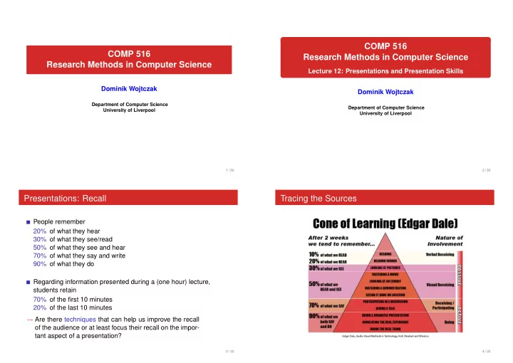

COMP 516 COMP 516 Research Methods in Computer Science Research Methods in Computer Science Lecture 12: Presentations and Presentation Skills Dominik Wojtczak Dominik Wojtczak Department of Computer Science Department of Computer Science University of Liverpool University of Liverpool 1 / 30 2 / 30 Presentations: Recall Tracing the Sources People remember 20% of what they hear 30% of what they see/read 50% of what they see and hear 70% of what they say and write 90% of what they do Regarding information presented during a (one hour) lecture, students retain 70% of the first 10 minutes 20% of the last 10 minutes � Are there techniques that can help us improve the recall of the audience or at least focus their recall on the impor- tant aspect of a presentation? 3 / 30 4 / 30
Attention During Lectures Questions 1 What are the different types of presentations? 2 What is the typical structure of a presentation? 3 What steps do one go through when preparing a presentation? 5 / 30 6 / 30 Types of Presentations Structure of Presentations Presentations typically serve one or more of the following purposes: Purpose: Information delivery, Information gathering, Instruction, or Persuasion Introduction � motivation, contextualisation, overview In addition, we can classify presentations along the following ‘scales’: Main body � main findings, elaboration Medium: Verbal, Verbal with Visual Aids, or Written Presence: In person — Transmitted — Recorded Conclusion Interaction: Monolog — Dialogue � comment on importance of findings, future work, sum- mary Time: Short — Long Audience: Small — Large Setting: Informal — Formal Preparation: Ad hoc — Scripted 7 / 30 8 / 30
Preparing Presentations Questions 1 Determination of the objectives of the presentation 2 Analysis of the audience 1 What is the purpose of visual aids? 3 Planning 2 What types of visual aids do you know? 4 Organisation of the material for effective results 3 Can you give a ‘style guide’ for slides? 5 Preparation of visual aids / handouts 6 Delivery practice 9 / 30 10 / 30 Visual aids: Purpose Visual aids: Types Prepared in advance, immutable at time of presentation Video Give structure to a presentation Slide projector Provide a point of reference for the speaker and the audience Created or reproduced during presentation, mutable at time of presentation Help an audience to remember Flip chart Chalk/White board Focus the attention of both audience and speaker Dual use Reinforce what is said Overhead projector (OHP) LCD projector (beamer) plus PC Interactive white board plus PC 11 / 30 12 / 30
Slides: Structure Questions Decide on a structure / theme for your slide in advance, 1 Can you give a ‘style guide’ for slides? then stick to it Consider Consider the following questions: Title Does the audience know me (and my affiliation)? Textual content How important is it that the audience remembers the title of my presentation? Fonts How many navigational hints are required? Colours How many graphics do I need to include? Can they be placed Graphics and animations consistently? The answers will influence how you should structure your slides 13 / 30 14 / 30 Slides: Titles Slides: Textual Content (1) Put a title on each slide Keep it simple Titles should be short but descriptive A typical slide should contain 20 to 40 words, maximum 80 Ideally, titles on consecutive slides should tell a story all by Do not try to fill all the space themselves Capitalise words consistently Prefer enumerated or itemised lists over plain text Either always capitalise all words in the title (except for words like ‘a’ and Use at most two levels of ‘subitemizing’ ‘the’), or Keep the number of items in a list low always only capitalise the first word in the title/subtitle Highlight important things The title of the whole presentation should be capitalised You might want to include it on every slide 15 / 30 16 / 30
Slides: Textual Content (2) Slides: Fonts Use short sentences Prefer phrases over complete sentences Aim for your text to be legible even under difficult conditions Break lines where there is a logical pause Use as few fonts as possible Do not hyphenate words Use a sans-serif font unless you use a high-resolution LCD projector Punctuate consistently Use monospaced and script fonts only for specific purposes No punctuation after phrases Avoid italics to express emphasis, use colour instead Complete punctuation in and after complete sentences Avoid decreasing font size to make more text fit on a slide 17 / 30 18 / 30 Slides: Colours Slides: Colour associations Red Danger, aggression, passion, stimulating Purple Royalty, religion, calming Use colours sparsely Green Soothing, trustworthiness, nature Avoid bright text on dark background Blue Restful, peaceful, relaxing Maximise contrast Yellow Well-being Normal text should be black on (nearly) white background Brown Nature, practicality, boring, close minded Avoid bright, light colours on white background Decide Be aware of what we associate with different colours what you want to highlight, e.g. keywords, main results, examples, current focus Test your presentation on the intended equipment if possible which colour you want to use for each of these categories Then apply this colour scheme consistently 19 / 30 20 / 30
Slide Structure and Content: Graphics and Animations Questions 1 How should you behave during a presentation? Graphics often convey concepts or ideas more effectively than text 2 What kind of behaviour should you avoid during a presentation? Use graphics as often as possible Graphics should only contain as much detail as necessary Consider Graphics always require explanation Stance Use animations to explain the dynamics of systems, algorithms, . . . Hands Do not use animations to simply attract attention Eye contact Do not use distracting special effects like fancy slide transitions Voice 21 / 30 22 / 30 Gesture and Body Language: Stance and Movement Gesture and Body Language: Hands Use hand gestures to emphasise points Be aware where you stand (centre stage vs side stage) Use open palm gestures, full arm gestures Do not obscure the screen Avoid aggressive gestures Stand tall, keep your head up most of the time Avoid hands in pockets, hands behind your back, Move from stillness to stillness, walk slowly hands clasped in front of your body 23 / 30 24 / 30
Gesture and Body Language: Eye Contact Gesture and Body Language: Voice Be aware of the acoustics of the room Maintain eye contact Speak clearly (do not shout or whisper) lighthouse beam Pause shortly at key points (adds emphasis) treat everyone equal Emphasise the right words, control your breathing do not look out of the window or on your watch Facial gestures and tone of voice should match your message do not focus too long on a single individual Do not rush, or talk deliberately slowly, but vary speed Keep an eye on the audience’s body language Do not talk to the screen does a point need further clarification? Do not turn your back to the audience and talk at the same time can you proceed more quickly than anticipated? Do not read from a script (cue cards are ok) 25 / 30 26 / 30 Seven Principles of Public Speaking Seven Principles of Public Speaking (Isa N. Engleberg: The Principles of Public Presentation. (Isa N. Engleberg: The Principles of Public Presentation. Harper Collins, New York, 1994) Harper Collins, New York, 1994) Purpose: Why are you speaking? Preparation: Where and how can you find good ideas and What do you want audience members to know, think, information believe, or do as a result of your presentation? for your speech? How much and what kind of supporting materials do you People: Who is your audience? need? How do the characteristics, skills, opinions, and behaviours of your audience affect your purpose? Planning: Is there a natural order to the ideas and information you will use? Place: How can you plan and adapt to the logistics of this What are the most effective ways to organise your place? speech How can you use visual aids to help you achieve your in order to adapt it to the purpose, people, place, etc.? purpose? 27 / 30 28 / 30
Seven Principles of Public Speaking Announcements (Isa N. Engleberg: The Principles of Public Presentation. Harper Collins, New York, 1994) tomorrow (19 Oct) 6pm: deadline for submitting your topic and Personality: How do you become associated with your message abstract in a positive way? in two weeks (2 Nov) at 6pm: deadline for submitting your What can you do to demonstrate your competence, presentations and preliminary bibliography charisma, and character to the audience? tomorrow’s practical is about locating and retrieving literature Performance: What form of delivery is best suited to the purpose of your speech? attendance will be monitored What delivery techniques will make your presentation 9 hours of free English language classes per week for intl students more effective? cgi.csc.liv.ac.uk/˜dominik/teaching/comp516/ How should you practice? resources.html 29 / 30 30 / 30
Recommend
More recommend