Cluster Analysis This lab will demonstrate how to perform the - PDF document
Cluster Analysis This lab will demonstrate how to perform the following in Python: Hierarchical clustering K-means clustering Internal validation methods Elbow plots Silhouette analysis External validation
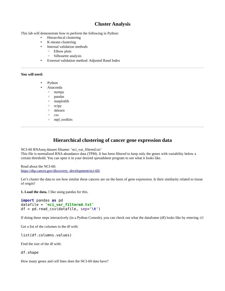
Cluster Analysis This lab will demonstrate how to perform the following in Python: • Hierarchical clustering • K-means clustering • Internal validation methods ◦ Elbow plots ◦ Silhouette analysis • External validation method: Adjusted Rand Index You will need: • Python • Anaconda ◦ numpy ◦ pandas ◦ matplotlib ◦ scipy ◦ sklearn ◦ csv ◦ mpl_toolkits Hierarchical clustering of cancer gene expression data NCI-60 RNAseq dataset filname: ‘nci_var_filtered.txt’ This file is normalized RNA abundance data (TPM). It has been filtered to keep only the genes with variability below a certain threshold. You can open it in your desired spreadsheet program to see what it looks like. Read about the NCI-60: https://dtp.cancer.gov/discovery_development/nci-60/ Let’s cluster the data to see how similar these cancers are on the basis of gene expression. Is their similarity related to tissue of origin? 1. Load the data. I like using pandas for this. import pandas as pd datafile = 'nci_var_filtered.txt' df = pd.read_csv(datafile, sep= '\t' ) If doing these steps interactively (in a Python Console), you can check out what the dataframe (df) looks like by entering df Get a list of the columns in the df with: list(df.columns.values) Find the size of the df with: df.shape How many genes and cell lines does the NCI-60 data have?
2. Process the data for clustering. Change the index from the numerical index (default when you load a pandas df) to the first column (gene names). df = df.set_index( 'gene' ) Get a list of all the cell lines. cells = list(df.columns.values) 3. Create a function that contains everything needed for performing hierarchical clustering. I’m calling mine dendrogrammer. Once it is written, call the function like so: dendrogrammer(df, cells) But before we can call it, we must create the function somewhere (in a new .py file, or at the top of a .py script): # display dendrogram # give it the labels for the data you want as leaves def dendrogrammer(df, leaf_labels): # all the things that dendrogrammer should do will go in here 4. More rearranging of the data. Dendrogrammer will take a pandas df as input. But we don’t need all that. Let’s import numpy to help with this processing. We’ll go ahead and import scipy for clustering and matplotlib for visualizing the results. At the top of the file where you have def dendrogrammer, add these things: import numpy as np from scipy.cluster.hierarchy import dendrogram, linkage from matplotlib import pyplot as plt #get just the numerical data from the dataframe in a numpy array D = df.values Plus, scipy’s clustering algorithm clusters the rows, not the columns. If we want to cluster the cell lines, we’ll need to transpose the data. # Check to see if we need to transpose D # Length of leaf labels should be same as the number of rows in D if len(leaf_labels) != len(D): D = np.transpose(D) 5. Perform hierarchical clustering. You can specify different linkage methods and distance metrics. Z = linkage(D, method='ward', metric='euclidean') Linkage methods could be ‘single’, ‘average’, ‘complete’, ‘median’, ‘centroid’, ‘weighted’, or ‘ward’ There are many possible distance metrics (e.g., ‘cityblockk’, ‘yule’, ‘hamming’, ‘dice’, ‘kulsinski’, ‘correlation’, ‘jaccard’, and many more), or you can create your own. See the scipy documentation for pdist for more info. 6. Plot the dendrogram. # plot dendrogram
plt.figure(figsize=(10, 6)) ax = plt.subplot() plt.subplots_adjust(left=0.07, bottom=0.3, right=0.98, top=0.95, wspace=0, hspace=0) plt.xlabel( 'Cell Line' ) plt.ylabel( 'Distance' ) dendrogram(Z, leaf_rotation=90., leaf_font_size=10., labels=leaf_labels) plt.savefig( 'dendrogram_nci60.png' ) Mine looks like this: What does this tell us? Who knows!? We can get a rough idea of which cell lines have similar global gene expression profiles. For instance, we see many of the ovarian cancer cell lines in the yellow cluster (OVCAR-3, OVCAR4, OVCAR8, SKO-OV-3) and some melanomas in the blue cluster (SK-MEL-28, MALME3M, SK-MEL-2, M14, MDA-MD-435). If we knew something about the mutational background, we could start looking for other rational explanations for the clusters. e.g., do any of the clusters share a driving mutation in RAS? BRAF? EGFR? Go ahead and adjust the linkage method and/or distance metric to see how the dendrogram changes.
K-means clustering of NCI-60 cancer gene expression data 1. Create a function that performs Principle Component Aanalysis. We will do this just because we want to visualize the data. This is a dataset with >9000 dimensions. We’ll use PCA to project into three dimensions. from sklearn.decomposition import PCA # Perform PCA on the data, for dimensionality reduction def PCAer(df): D = df.values D = np.transpose(D) pca = PCA() pca.fit(D) projected = pca.fit_transform(D) return projected 2. Create a function for K-means analysis. I’ll call mine kmeanser. We’ll call kmeanser like so: [proj, labels, centroids] = kmeanser(df,k) And kmeanswer should contain: from sklearn.cluster import KMeans # k-means clustering # user supplies k def kmeanser(df,k): # we'll perform a PCA just so we can plot the clustering results Dpc = PCAer(df) # Now kmeans kmeans = KMeans(n_clusters=k) # initialize kmeans = kmeans.fit(Dpc) # compute K-means clustering labels = kmeans.predict(Dpc) # get cluster labels for data points C = kmeans.cluster_centers_ # get cluster centers out = [Dpc, labels, C] return out 3. Call the K-means function and cluster the NCI-60 data into six groups. Call the function a few times, and write all the results to a file. How do the cluster assignments change from run to run? How do they compare to the groups from the hierarchical clustering? How do they change if we don’t run a PCA? import csv # Export list of cluster labels matrix = zip(cells, labels1, labels2, labels_nopca) with open( 'kmeans_clusters.txt' , 'wb' ) as f: writer = csv.writer(f, delimiter= '\t' ) writer.writerows(matrix) 4. Plot the data from mpl_toolkits.mplot3d import Axes3D
# plot the clusters fig1 = plt.figure() ax1 = fig1.add_subplot(111) ax1 = Axes3D(fig1) # plot the projected data with assigned clusters ax1.scatter(proj[:, 0], proj[:, 1], proj[:, 2], c=labels, s=50, cmap= 'Accent' ) # plot the centroids ax1.scatter(centroids[:,0], centroids[:,1], centroids[:,2], c=range(k), s=200, marker= '*' , cmap= 'Accent' ) fig1.show() Show or save the figure: fig1.savefig( 'kmeans_nci60.png' ) K-means clustering (k=6) on the NCI-60 RNAseq data. Stars mark the cluster centroids. Axes are the first three principle components. Try changing the number of clusters.
Cluster evaluation How many clusters should we have? Does cluster assignment match tissue of origin? 1. Elbow plot. One common way to gauge the number of clusters ( k ) is with an elblow plot, which shows how compact the clusters are for different k values. This assumes that we want clusters to be as compact as possible. Write a function that runs a K-means analysis for a range of k values and generates an Elbow plot. This function should take the df as input You should generate a vector of k values and a measure of the cluster compactness. Hint: The within-cluster sum-of-squares is a good metric for how “internally coherent” the clusters are. This measure can be obtained, after running a K-means clustering as shown previously, with: kmeans.inertia_ Elbow plot for k = 2 to 50 clusters of the NCI-60 RNAseq data, clustering by cell line This dataset generates a very smooth curve for the elbow plot, without a clear elbow. This indicates that the clusters aren’t very compact for any k . We can try other methods of evaluating the optimal k . 2. Average Silhouette score. The average Sihouette score measure cluster compactness and cluster separation. For each data point: • a : the mean distance between the data point and all other data points in the same cluster • b : the mean distance between a data point and all other points in the next nearest cluster The Sihouette score for a single data point is then:
Recommend
More recommend
Explore More Topics
Stay informed with curated content and fresh updates.
