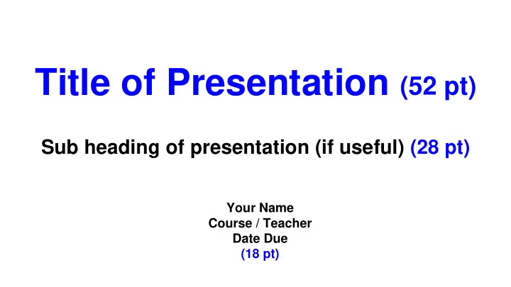

Title of Presentation (52 pt) Sub heading of presentation (if useful) (28 pt) Your Name Course / Teacher Date Due (18 pt)
Example: Car Buying Project Balancing “Wants” and “Needs” Jimmy Smith Automotive Technology / Mr. Jones November 22, 2015
Slides Have a Consistent Layout Train the reader’s eyes to scan the slide The heading and body of slides are consistent ...in font size (24 pt) ...in font - use Arial or other sans serif (Arial, Calibri ) ...in color ...in where points are placed on the slide
Simple Heading - (30 point) Bullets (24 pt) No more than one full sentence, if possible. No more than seven (7) points per slide. Space bullets as evenly as possible on slide Align left margin Minimal animations & transition effects
Color of Font & Background Highest contrast possible dark against light light against dark ...in color - use black on white or white/yellow on black Avoid difficult to read color combinations avoid pinks, reds, and greens ...in font - use Arial or other sans serif
Images in a Presentation Use photos, charts, tables, and graphs Use to enhance information; must explain Consistent layout Image size = 1600 x 1200 (Google image search) Do not write text over images If necessary, place image on its own slide
1967 Mustang Fastback ● 1st major redesign ● $2,692 Standard Fastback ● Choice of 5 Engines - 120-320 HP ● Redesigned Grill ● Side Scoops ● Concave vs Convex Rear ● Larger Tail Lights
Print Your Slides - with Notes File - Print Settings/Preview 1 Slide w Notes
Proof & Practice the Presentation Proof your sliddes for spelling Practice using your note cards Look at audience, rarely the screen Stand straight, project voice Slow Down (nervous = talk fast)
Recommend
More recommend