As always, here are the four charts that will help you in the event - PDF document
As always, here are the four charts that will help you in the event of the next scary market. Past is not Prologue Based on research from Mark Hulbert Here are the odds that U.S. stocks will rise this year. There is a two-out-of-three chance
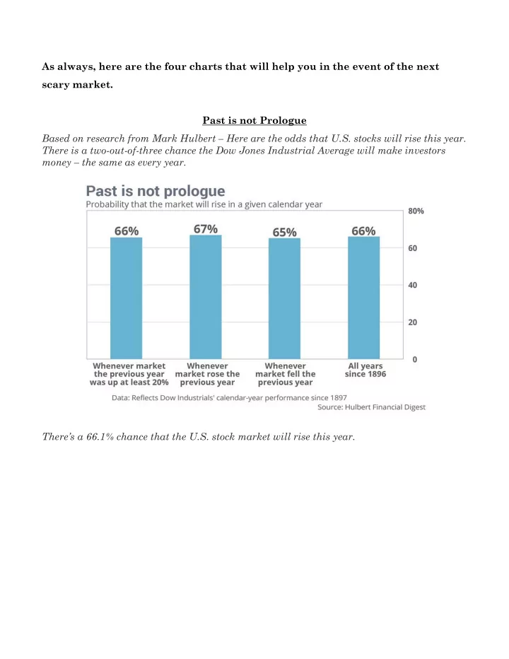
As always, here are the four charts that will help you in the event of the next scary market. Past is not Prologue Based on research from Mark Hulbert – Here are the odds that U.S. stocks will rise this year. There is a two-out-of-three chance the Dow Jones Industrial Average will make investors money – the same as every year. There’s a 66.1% chance that the U.S. stock market will rise this year.
Calendar Year Returns vs. Intra-year Declines A favorite of ours; it shows the calendar year return of the S&P500 for the last 38 years through 2017, represented by a blue bar, overlaid with each calendar year’s correction, represented by a red dot. There have been many years when the S&P 500 sold off sharply and then ended the year with gains. The index has been up in 32 of the last 38 years. The trouble is, no one knows what type of year we will see.
Markets Rise & Fall A chart made popular by Edelman Financial, which charts the reality of long-term market trends and what one has had to endure to make money over time. Note: the current bull market is now 106 months in length (03/09 – 12/17) with a 295% total gain from the previous bear market low (03/09). Duration to Break-Even This chart details the duration of time (number of months) until the market reached a break- even point from the above bear market lows.
Recommend
More recommend
Explore More Topics
Stay informed with curated content and fresh updates.

