and Visualizations with Examples for Slides by Michael Hahsler - PowerPoint PPT Presentation
Essential Data Preparation, Descriptive Statistics and Visualizations with Examples for Slides by Michael Hahsler Purpose 1) Import data and "get used" to the data. 2) Clean the data (e.g., find missing values, outliers, mistakes)
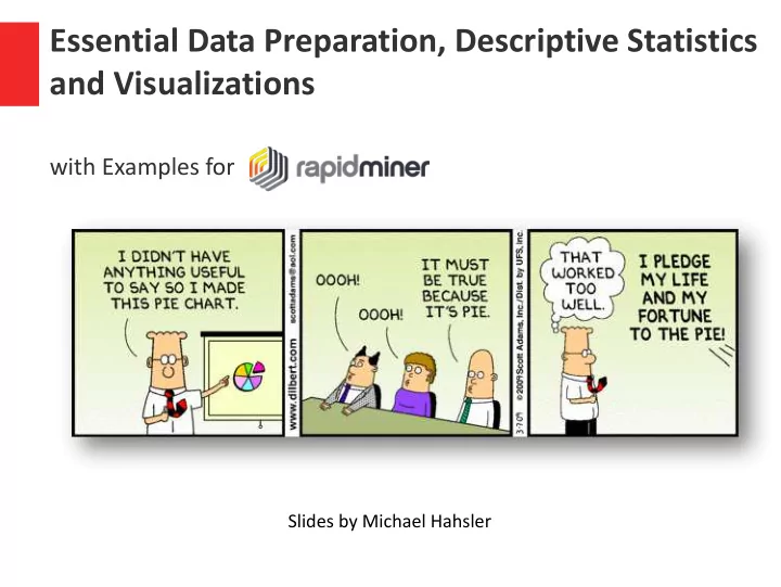
Essential Data Preparation, Descriptive Statistics and Visualizations with Examples for Slides by Michael Hahsler
Purpose 1) Import data and "get used" to the data. 2) Clean the data (e.g., find missing values, outliers, mistakes) 3) "Make sure the data makes sense." 4) Find simple relationships between variables. 5) Prepare data for predictive/prescriptive modeling.
• Install RapidMiner Studio and obtain an Gartner 2019 Magic Quadrant for Data educational license (see course website). Science and Machine Learning Platforms • The dataset for the examples can be obtained from http://michael.hahsler.net/SMU/EMIS3309/da ta/census.csv • Rapidminer processes for this slide set are available here (save and import process in Rapidminer): http://michael.hahsler.net/SMU/EMIS330 o 9/data/rapidminer/Basic_Statistics_and_V isualizations.rmp http://michael.hahsler.net/SMU/EMIS330 o 9/data/rapidminer/Cleaning_and_preproc essing.rmp
Scale of Measurement Information can be measured on different scales. Depending on the scale, different operations/visualizations are appropriate. Scale Mathematical Advanced Central Examples operators operations tendency Nominal Gender, eye Color, Zip =, != Grouping Mode code Categorical Ordinal >, < Sorting Median hardness of minerals, {good, better, best}, grades Interval +, − Difference Mean, temperature in Celsius Variance or Fahrenheit temperature in Kelvin, × , / Geometric mean, Ratio Ratio Quantitative monetary quantities, percent variation counts, age, mass, length (has a meaningful 0)
Scale of Measurement What is the scale of measurement (nominal, ordinal, or interval/ratio) for the following. What operations are appropriate. • Grades (letter): A, B, C, D, F • Grades (for GPA): 4, 3, 2, 1, 0 • Points on a test: 0-100 • Age: 0, 1, 2, … years old • Age: <20, 21-35, 36-50, 51+ • Waiting time: E.g., 2.5 minutes • Number of students in classes: E.g., 32 • Percentage of female students in class: E.g., 60% • Student ID: E.g., 9212354 • Date: March 26, 2018
Importing Data For the examples we use a dataset with census data at the ZIP-code level (Data and processes can be found on the class website). Features/Attributes should not be integer! Observations Quantitative – ratio Categorical (RM: integer or real) (RM: polynominal)
Single Variable - Quantitative RapidMiner • Statistics 5-Number Summary: • Operator Aggregation Descriptive Stats min • Rapidminer gives you this for population per Zipcode: 1 st quartile • Median • Mean • 3 rd quartile • max • Histogram Visualization to show the distribution
Single Variable - Categorical RapidMiner • Statistics Descriptive Stats Count table • Bar chart for counts Visualization • Pie chart (not ideal for more than a few groups)
Data Cleaning RapidMiner Operators in Cleansing – Missing values? Is this the result of reading the data? Are missing values correctly read in (or are there values like 99, 'N/A' or '.' as text)? Do we have to impute the missing values? – Outliers and strange values Identify in histograms and scatter plots. Examples: many zeros, weird visual pattern visible. Might be the result of data collection. Needs investigation and cleaning! – Duplicates: Are these a data problem? – Dates : Make sure that these are read in correctly!
Data Cleaning Set a higher number of bins. What do the spikes at 0 and 200,000 for median family income mean? What should we do?
Two Variables - Quantitative RapidMiner : Use Descriptive Stats Correlation Correlation Matrix node Example: population and # of housing units per zipcode have a (Pearson) correlation coefficient of: 0.975 Scatterplot Visualization • Is there a relationship? • Multivariate Outliers
Two Variables - Categorical Cross-tabulation (i.e., contingency table) Descriptive Stats RapidMiner Aggregation Pivot Bar chart (counts) Visualization Stacked bar chart (proportion)
Two Variables - Mixed RapidMiner : Use Compare 5-number statistic Aggregate node grouped by categorical variable. Descriptive Stats Bar chart for individual statistic to compare groups or box plot Visualization
Multiple Variables Are usually broken down into pairwise comparisons. RapidMiner : Use Correlation Matrix Correlation matrix Scatterplot matrix
Multiple Variables (cont.) Comparing multiple quantitative variables (or comparing a single quantitative variable between groups defined by another categorical variable). Tables with group-wise statistics or Boxplot
Basic Descriptive Statistics and Data Visualization Cheat Sheet Single Variable - Explore the distribution Statistics Visualization Categorical Variable Counts Bar chart Quantitative Variable 5-number summary Histogram Two Variables – Compare and explore the relationship Statistics Visualization Categorical Variables Contingency table Grouped bar chart (Cross tabulation) Quantitative Variables Correlation Scatter plot Mixed Variables Group-wise Box plot statistics (e.g., average) Bar chart of group statistics 3+ Variables Break it down into pairwise statistics or plots. E.g., Correlation matrix, scatter plot matrix, box plot.
RapidMiner Data Transformation Operators in Blending and Cleansing Some data needs to be transformed to be more useful for visualization of for a predictive model. Observations Sampling/Filtering examples • Grouping and aggregation • Features Feature Selection (select attributes) • Feature Generation (generate aggregation, etc.) • Nomalization to make features comparable (e.g, z-score) • Discretization (binning) •
Sampling Population: all items of interest (e.g., ZIP code areas in the US) Sample: a subset of the population. A selection of 500 ZIP codes. The purpose of sampling is to obtain sufficient information to draw valid conclusions about the population. In data science, we often need to sample to reduce the data size.
Grouping and Aggregation Many plots (e.g., bar charts) apply grouping and aggregation (e.g., counting the number of ZIP codes per state) automatically. Important for comparing groups.
Feature Selection • Manually select/delete features using expert knowledge. • Delete features of low quality (e.g., many missing values) • Remove features that are highly correlated (we only need one) • For predictive models: Find features that are highly “predictive.” E.g., correlated with the variable to be predicted.
Feature Generation Create better variables. For example: • Calculate population density from population/area • Calculate proportions or percentages for comparison. E.g., water to land area • In a medical setting: Calculate the body mass index (BMI) from height and weight • For predictive models: Square or multiply values to give larger values more impact.
Normalization Make variables with a vastly different range comparable. • Normalize between 0 and 1 • Z-score: Normalize to zero mean and 1 standard deviation Example: Compare age and income of a person.
Discretization • Transform a quantitative variable into a qualitative variable. • Example: In a crime data set, change age from a number into a variable that indicates if the perpetrator is younger than 18 (subject to juvenile justice).
Recommend
More recommend
Explore More Topics
Stay informed with curated content and fresh updates.
